
Arc'teryx Rebird
What We Did
Strategy
Design
Branding
Copywriting
Digital Marketing
Industry
A springboard for circularity
In 2020, Arc’teryx needed a cohesive look and feel for their Used Gear program that would work with existing brand standards and could extend to other circular initiatives. At the time, circularity was a new term in the industry, and only a few brands were making this a meaningful undertaking.
A year later, the Used Gear Program naturally evolved into ReBird—a single brand to house all of the brand’s circularity efforts—which Monday also brought to life.

Crafting a unified storytelling strategy
Our challenge was to create a single parent brand to house this growing lineup of circularity initiatives and ensure it nested effortlessly within the existing Arc’teryx brand.
We started with a single story to sum up the brand’s approach to circularity, while leaving room to expand the narrative. We crafted a north star to guide our initiatives—“Keep the Good in Play”—and then built a series of sub messages rooted in core tenets: reduce, reuse, repair.

Designing a dynamic brand system
Our team was inspired by the possibility of grids—symbolizing the engineering and innovation Arc’teryx is grounded in. We rooted our “Core” icon in ReBird’s positioning: the idea that circularity permeates from the heart of the business and flows out to every part. The three layers of the Core reflect the three principles of circularity and make it incredibly dynamic. It was imbued with movement to take on new forms that can represent new initiatives within the ReBird program.

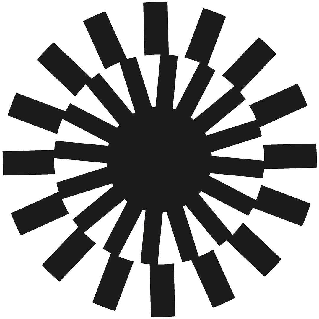


Animation was key when we activated this concept—creating a series of assets that would translate to ads, video and the web. By imagining different crops and rotations, this became a pattern that brought visual interest to legacy photography or video content.
The Used Gear design system evolved in tandem with the development of ReBird, culminating in a unified digital hub under ReBird.

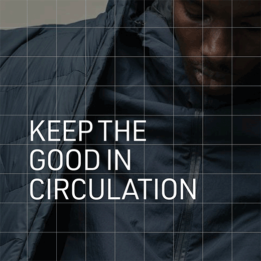
An immersive digital hub
Once our brand foundations were established, we then created a digital platform for all things ReBird—pulling the audience deep into this world through story. Working in partnership with the Arc’teryx team and the all-star development team at Pound and Grain, Monday provided the design and IA.
Beautiful type set the tone and the Core was introduced as a signifier that stays with the user through the journey. As you scrolled, the Core rotated and expanded with the unfolding vision of a future with zero waste.


A statement-making launch
We brought all the pieces together in a set of launch assets. We leaned into our visual toolkit for ReBird, using the animated Core paired with simple product photography and video.
The result was very “Arc’teryx” but at the same time fresh and full of new purpose. A launch strategy saw these assets living within the brand’s existing channels in well-paced social posts, dedicated emails and in-store assets.


